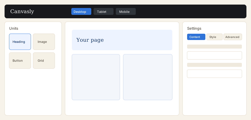
Units are the pieces you drag from the left library onto the canvas. Select a unit to edit it in the right panel. That panel uses Content, Style, and Advanced. Pro units appear in the same library when Canvasly Pro is active. Shop units appear only when WooCommerce is active.
Updated . Covers Canvasly 0.12.76 and Canvasly Pro 0.6.3.
Pick a unit on the left, drop it on the canvas, then change it on the right.
Add a unit
Open the page with Edit with Canvasly.
In the left panel, search or filter by category and click or drag a unit.
Drop it into a Container or a Grid, or onto the page.
Use the right panel to change the text, image, link, or layout.
Save, then publish or update the page in WordPress.
Right-click a unit in the library to add or remove it from Favorites. Container cannot be disabled in Units Manager. Other units can be hidden there.
Grid
Grid places children in rows and columns. A child can span more than one cell.
The Grid unit is a layout that holds other units. Its controls include columns, rows, grid template columns, grid template rows, column gap, row gap, auto flow, align, justify, minimum column and row sizes, auto columns and rows, outline, width, and dense auto-flow. The editor draws a placement grid so you can set column, row, and span. Dragging the left, right, top, or bottom edge resizes the unit, and neighboring columns share the width. A size tip shows while you drag. The Features setting “Grid container” is active by default and covers the same kind of layout on a Container.
Usage: add Grid from the layout category, then drop Heading, Image, or Button into the cells. Select a child to set where it sits.
Right-click menu
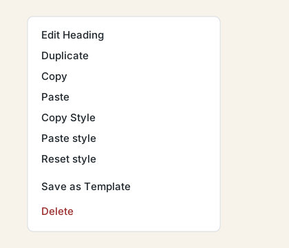
Right-click a unit on the canvas for these actions. Shortcuts can be changed in the editor.
On a unit, the menu offers Edit, Duplicate, Copy, Paste, Copy Style, Paste style, and Reset style. Tabs, Accordion, and Toggle also offer Convert to nested. Container and Grid offer Add New Container and Save as Template. Any unit can be saved as a component. Structure opens the navigator. Delete removes the unit.
On empty canvas, the menu offers Paste, Paste All Content, Add New Container, Copy All Content, Delete All Content, and Structure. Copy and paste are kept in the browser so they work across pages and tabs.
TODO: The plugin source does not name a “pink tab.” The right-hand settings use the labels Content, Style, and Advanced. The left side is the unit library. If a pink tab appears in your copy of the editor, its purpose is not described in these files.
WordPress block: Canvasly Template
This is the one WordPress block the plugin registers. Its name in the editor is Canvasly Lite Template, in the Canvasly category. It inserts a saved Canvasly template. It still shows in the normal WordPress editor, where the rest of Canvasly does not load.
Setting
Default
What it does
Template id
0
Which saved template to show. 0 means none is chosen.
The block can be wide or full width, and it supports an HTML anchor and a CSS class. Usage: in the WordPress block editor, add Canvasly Template, then pick the saved template.
Layout units
Container
Library category: layout. Holds other units.
The main box for sections of a page. The readme describes a semantic HTML tag, a link for the whole container, a background overlay, shape dividers, and a self-hosted background video. It cannot be turned off.
Usage: add Container, then drop other units inside it.
Inner Section
Library category: layout.
A nested layout unit registered with Container and Grid.
Usage: add Inner Section inside a Container when you need another grouped region.
Grid
Library category: layout. Holds other units.
See the Grid section above. Defaults are not a single fixed column count in the short control list; the editor’s grid helper treats three columns when a count is missing.
Basic units
Heading
A title. The readme says it can be linked and can use size presets. Usage: add Heading and type the title in Content.
Text Editor
Body text. The readme mentions a drop cap and columns. Usage: add Text Editor and write in the text control.
TinyMCE Text Editor
Library category: basic.
A text unit that uses the WordPress visual editor. Usage: add it when you want that editor’s formatting tools.
Button
A link styled as a button. The readme mentions sizes, icon placement, and alignment. Usage: set the label and the link.
Divider
A horizontal rule. The readme mentions patterns and optional text or an icon. Usage: drop it between sections.
Spacer
Empty vertical space. Default height is 40. Usage: set Height.
Icon
A single icon from the Canvasly icon library. Usage: pick an icon and, if you want, a link.
Icon List
A list of items that each have an icon. The readme mentions an inline layout and dividers. Usage: add rows in the list control.
Icon Box
An icon with a title and text. Controls include icon view, shape, title, text, link, layout, alignment, colors, and hover animation. Usage: choose an icon and write the title.
Progress Bar
A labeled bar. Controls include label, value, bar style, percentage, inner text, colors, height, and radius. Usage: set the label and the value.
Counter
A number that can count up. The readme says the number, prefix, and suffix update on the canvas while you edit. Usage: set the number and optional prefix or suffix.
Alert
A notice. The readme says it can be dismissed. Usage: write the message and choose whether visitors can close it.
Accordion
Stacked panels that open and close. The readme mentions multiple items, icons, and FAQ schema. Usage: add a title and content for each item. Right-click to convert to Nested Accordion.
Toggle
Similar stacked panels. Usage: add items, or convert to Nested Toggle from the right-click menu.
Tabs
A row or column of tabs. The readme mentions vertical layout, alignment, and styles. Usage: name each tab and its content. Right-click to convert to Nested Tabs.
Nested Tabs
Tabs whose panels can hold any unit. Shown when the Nested experiment is active, which it is by default. Usage: add a tab, then drop units into that panel.
Nested Accordion
An accordion whose panels hold any unit. Usage: add an item, then drop units inside it.
Nested Toggle
A toggle whose panels hold any unit. Usage: same as Nested Accordion.
Social Icons
Links to social profiles. The readme mentions brand colors, shapes, and a grid. Usage: add each network and its URL.
Star Rating
Stars, including half stars in the readme. Controls include scale, rating, unmarked style, title, align, size, gap, and colors. Usage: set the rating.
Testimonial
A quote with the person’s details. Usage: enter the quote and the name.
Price Table
A pricing box. Usage: set the plan name, price, features, and button.
Text Path
Text that moves along a path. Defaults are the words “Canvasly” and a speed of 20. Usage: change Text and Speed. Speed is kept at 5 or higher.
Shortcode
Runs a WordPress shortcode you type. Default text is empty. Usage: paste a shortcode such as [canvasly_lite_template id="42"] into the Shortcode field.
HTML
Custom HTML, edited with the code editor when that feature is active. Usage: paste the markup into the HTML field.
Code
Shows code in a preformatted block. Defaults are empty code and language “text”. Usage: paste the code and choose a language.
Media units
Image
Library category: media.
The readme lists image, size, link, lightbox, caption, alt text, object fit, object position, border, radius, shadow, opacity, spacing, position, and responsive settings. Usage: choose an image from the Media Library and fill in alt text.
Image Box
An image with a title and text. Controls include image, alt, title, text, link, layout, alignment, width, spacing, radius, opacity, and colors. Usage: choose the image and write the title.
Gallery
Several images. The readme mentions captions and hover effects. The editor can lay them out as grid, masonry, or justified. Usage: open the gallery control and choose images.
Image Carousel
A slideshow of images. The readme mentions slides to show, fade, autoplay, and captions. Usage: choose the images and how many show at once.
Video
YouTube, Vimeo, Dailymotion, VideoPress, or a file you host. The readme mentions overlay, lightbox, and aspect ratio. Usage: paste the video URL.
Audio
An audio player. A hosted file or an allowed oEmbed URL can be used. Usage: set the audio URL.
SoundCloud
A SoundCloud player. Controls include URL, visual mode, height, autoplay, buying, liking, download, artwork, sharing, comments, play count, user, and player color. Usage: paste the SoundCloud URL.
Content units
Form
Library category: content.
A form on the page. reCAPTCHA runs only when Form reCAPTCHA is active and both keys are saved. With Pro, submissions can be stored under Canvasly → Submissions. Usage: add fields, set the button label, and choose where the form sends its message.
Read More
A text link. Defaults are the words “Read More”, the URL “#”, and the same window. Usage: change Text, URL, and whether the link opens in the same window or a new one.
Rating
A rating made of icons. Controls include rating, max, label, icon, empty icon, color, size, and CSS class. Usage: set the score and the maximum.
Link in Bio
A title, subtitle, avatar, and a list of links. Usage: add the profile image and one link per line or item, depending on the control.
Site Menu
A WordPress menu that collapses under a chosen width. Defaults: no menu selected, horizontal layout, breakpoint 782, empty label. Usage: pick a menu from Appearance → Menus. The same output is the canvasly_nav shortcode.
Menu Anchor
A jump target. Default anchor id is section-1. You can also attach a menu. On the canvas the target is shown, and the page scrolls to that id. A sticky header can be cleared with the CSS custom property --lb-anchor-scroll-offset. Usage: set Anchor ID, then link a button or menu item to #section-1.
Collection Loop
Lists posts, custom types, or terms. The readme describes a query builder, an item layout that is either inline or a saved template, grid or list, and pagination by numbers, previous and next, or load more. Active by default under Features. Usage: choose what to query, then design one item.
Advanced units
Embed
Embeds an allowed URL through WordPress oEmbed, with a cache. Usage: paste a single URL the site is allowed to embed.
Google Maps
A map. Defaults are an empty address, zoom 14, and height 320. With an API key and the Maps feature active, it uses the Embed API. Otherwise it uses the public iframe. Usage: type an address.
Sidebar
Prints a registered WordPress widget area. Usage: choose the sidebar.
WordPress Widget
Prints one registered WordPress widget. Controls include widget, title, widget options, sidebar, and CSS class. Usage: choose the widget from the list.
Template
Embeds a saved Canvasly template inside the page. Usage: pick the template. The same result is the shortcode [canvasly_lite_template id="42"] and the WordPress block.
Component
Inserts a reusable component. Components are saved from the right-click menu and edited as their own items. Usage: insert a component you already saved.
Flip Box
A card with a front and a back. Usage: set the front and back content, then view the page to see the flip.
Login
The WordPress login form. Defaults are the title “Login”, the button “Log In”, and an empty redirect. Usage: set the title, button label, and where to send the person after login.
Canvasly Pro units
These are in the library when Pro is running. Pro widgets use the content category unless noted. Theme units also use content. Payment Form and Payment Button use basic. Taxonomy Filter uses advanced.
Content widgets
Share Buttons
Buttons that share the page. Usage: add the unit and choose which networks to show.
Blockquote
A styled quotation. Usage: enter the quote.
Call to Action
A prompt with a button. Usage: write the message and the button link.
Animated Headline
A headline that changes. Usage: enter the rotating phrases.
Countdown
A timer toward a date. Usage: set the end date.
Slides
A slide deck. Usage: add slides and their content.
Nested Carousel
A carousel whose slides can hold other units. Usage: add a slide, then drop units into it.
Media Carousel
A carousel of media items. Usage: choose the media.
Table of Contents
Links to headings on the page. Usage: place it where the list should appear.
Progress Tracker
Shows how far the visitor has scrolled or progressed. Usage: place it on a long page.
Hotspot
An image with clickable points. Usage: set the image and add hotspots.
Price List
A list of named prices. Usage: add each item, name, and price.
Off-Canvas
A panel that sits off the page until it is opened. Usage: put the panel content inside it and set how it opens.
Floating Buttons
Buttons that stay on the screen. Usage: add each button and its link.
Search
A search box. Usage: place it in a header or sidebar area.
Lottie
An animation file. Usage: choose the Lottie file.
Video Playlist
Several videos in one list. Usage: add each video URL.
Code Highlight
Code with highlighting. Usage: paste the code and choose the language.
Nav Menu
Library category: content.
A navigation menu from Pro. Usage: choose the menu to display.
Taxonomy Filter
Library category: advanced.
Filters a loop by category or other taxonomy. Usage: place it with a Collection Loop and choose the taxonomy.
Payment Button
Library category: basic.
A hosted PayPal or Stripe button. The readme says these stay hosted payment buttons. Usage: set the amount and the gateway. Site-wide tax and fees are under Canvasly → Payments.
Payment Form
Library category: basic.
A form that checks out through the payment settings. Turn on Sales Tax, Bank Fee, or both. Each accepts a percent that is calculated and added to the total. Leave a percent blank to use the rate from Canvasly → Payments. Shipping is a fixed amount added to the total. Gateways offered under Canvasly → Payments appear as pay buttons at the bottom of the form. Each button uses a Payment Button on the same page with this form key.
Theme units
Use these inside Theme Builder templates so the text comes from the current page, post, or site.
Site Logo
The site logo. Usage: place it in a header template.
Site Title
The WordPress site title. Usage: place it in a header.
Site Tagline
The WordPress tagline. Usage: place it near the site title.
Page Title
The title of the current page. Usage: place it at the top of a single or page template.
Post Title
The title of the current post. Usage: place it in a single template.
Post Excerpt
The excerpt of the current post. Usage: place it under the title.
Post Content
The body of the current post. Usage: place it where the article should appear.
Post Info
Meta such as date or author, as the unit’s controls allow. Usage: place it near the title.
Featured Image
The post’s featured image. Usage: place it in a single or archive item.
Author Box
The author’s name and details. Usage: place it after the post.
Post Navigation
Links to the previous and next post. Usage: place it at the end of a single template.
Comments
The WordPress comment area. Usage: place it under the post content.
Archive Title
The title of the current archive. Usage: place it at the top of an archive template.
Archive Posts
The list of posts for the current archive. Usage: place it under the archive title.
Breadcrumbs
A trail of links back to the home page. Usage: place it under the header.
Search Form
The theme search form. Usage: place it in a header or 404 template.
Sitemap
A list of site content. Usage: place it on a sitemap page.
Shop units
These load only while WooCommerce is active. Product and product-archive templates use the theme locations. Cart, checkout, and My Account render WooCommerce’s own forms.
Products
A product list. Usage: place it on a shop layout.
Archive Products
Products for the current shop archive. Usage: place it in a product archive template.
Product Title
The current product’s name. Usage: place it on a product template.
Product Image
The current product’s image. Usage: place it beside the title.
Product Price
The current product’s price. Usage: place it under the title.
Product Rating
The current product’s rating. Usage: place it near the price.
Product Stock
Whether the product is in stock. Usage: place it near the add-to-cart button.
Product Meta
SKU and categories from WooCommerce. Usage: place it under the product summary.
Product Short Description
The short description. Usage: place it above the full content.
Product Content
The long product description. Usage: place it in the product body.
Product Data Tabs
WooCommerce’s product tabs. Usage: place them under the summary.
Add To Cart
The add-to-cart control from WooCommerce. Usage: place it with the price.
Product Related
Related products. Usage: place them after the product.
Product Upsells
Upsell products. Usage: place them on the product template.
Shop Notices
WooCommerce notices such as “added to cart.” Usage: place them near the top of a shop template.
Menu Cart
A cart link for a menu or header. Usage: place it in the header.
Cart
WooCommerce’s cart. Usage: place it on the cart template.
Checkout
WooCommerce’s checkout. Usage: place it on the checkout template.
My Account
WooCommerce’s account area. Usage: place it on the account template.
Purchase Summary
A summary after purchase. Usage: place it on the thank-you content.
Other things visitors and editors see
Popups. A Popup template from Theme Builder is hidden in the footer and can open on load, scroll, click, exit, or inactivity. How often it shows uses a cookie set by the site. A link action can open a popup. A Canvasly form inside a popup still works.
Editor notes. With Pro, a logged-in person who can edit the page can leave a note on a unit. Notes are not public comments and are not printed on the site.
Saved templates. Stored as private content under Canvasly, with categories. Types include Page, Section, Container, Header, Footer, Single, Archive, Loop Item, and Floating Button. Pro adds the Theme Builder types.
Maintenance. When maintenance or coming soon is on, visitors see the chosen template. Excluded roles still see the live site.